In conversation with Designer Rob Ghitoaica
What's your role here at HG?
I’m the resident designer!
What have you been working on lately?
I’ve been working on quite a number of things, mostly monthly content for brands such as IVECO, L’Oreal, Patak’s, and New Age Caravans. More specifically though I recently worked on the Dulux Jellybeans campaign, which was quite fun!
What has been your favourite project to work on in 2022?
Honestly, it’s really hard to choose! I’ve had such a large variety and length of projects throughout the year, I think every brand had something different that I loved working on.
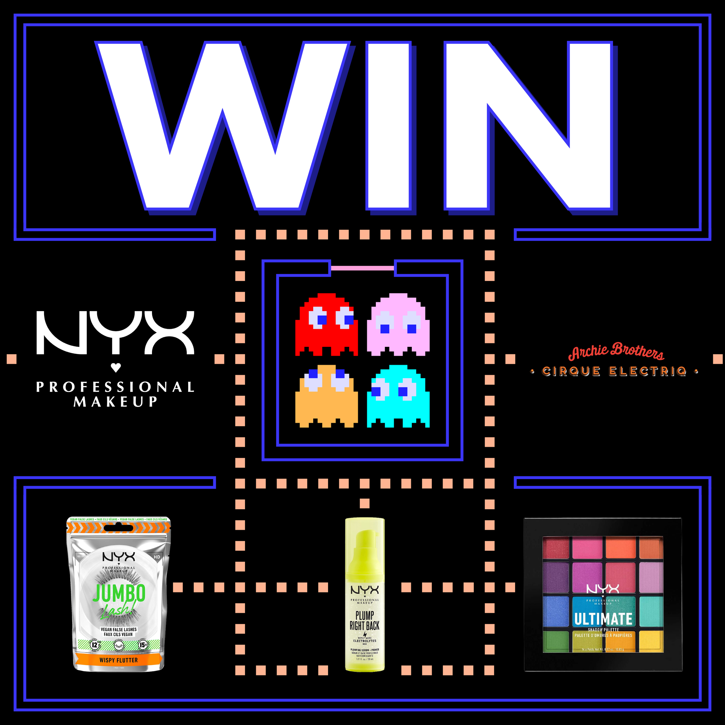
The one that comes to mind the most would probably be an asset I did for NYX cosmetics. I created a Pacman-style level out of vector shapes while incorporating NYX products, which I really enjoyed creating because of the creative liberties given as well as the problem-solving aspect of making sure the products were aligned properly within the composition of the design.
How have you found coming out of Melbourne lockdowns and working more IRL this year?
I’ve thoroughly enjoyed being able to work in the office. There’s a certain element of productivity and collaboration that you just can’t get when working from home in my opinion. It’s difficult to stay focused for long periods of time, especially if you work from your bedroom (a place you’re used to relaxing in, not working!).
What are 3 things that people should consider when creating content for social media?
One of the most important things to consider when creating social content is definitely prioritising the main message you’re trying to get across to the audience. Instead of trying to wow the audience with the glitz and glam of exaggerated animations or packing in as much visual stimuli as possible, focus on highlighting the important imagery while using simplistic imagery to subtly support it.
Another thing to consider is broadening the content’s visual appeal, as having a niche brand can especially be difficult to draw engagement from if you’re constantly trying to reach a singular demographic.
Lastly, make the content fun! There are so many examples of dry or overplayed approaches in social media design. Think outside the box and find inspiration not only from Pinterest but with traditional forms of advertising, such as magazines, catalogues, and examples from around the city you live in!
In doing this you can hopefully create a much more informed, original design that provides a bold fresh look and appeal instead of becoming lost in an ocean of blasé trends.


